
For this college project I constructed a Zine around the lyrics from seven different Noah Kahan songs. Shown above is part of the research and experimental stages for this Zine, I annotated the lyrics to pick out key imagery and then used the matrix technique to help establish which visual forms of the word best portrayed the meanings throughout the song. I used platforms such as Pinterest to help inspire some visuals. Moreover I used mind maps to gather my initial ideas and note down any thematic and contextual research.

Shown above is the completed version of my Zine alongside my style inspiration sourced from an artist on Tiktok. Each page/ half of a the double spreads focuses on separate Noah Kahan songs, with the key lines/lyrics being presented around my illustrations. In order for the Zine to have a consistent cohesive look I kept the background and text colours the same throughout and using pops of colour to better emphasise the illustrations.

This project was centred around the theme of 'Choice Paralysis', which I interpreted to be the anxious and paranoid feeling of having to make decisions alone in an environment of overwhelming choices- where better to portray this than a supermarket, a location this feeling is felt most days by the general population. For this I did my own primary photography in Asda and looked into artists like Michael Volpicelli and Kevin Lucbert for style and colour inspiration. I experimented with thumbnails and the matrix technique to find a layout/ scene that would represent this theme authentically.
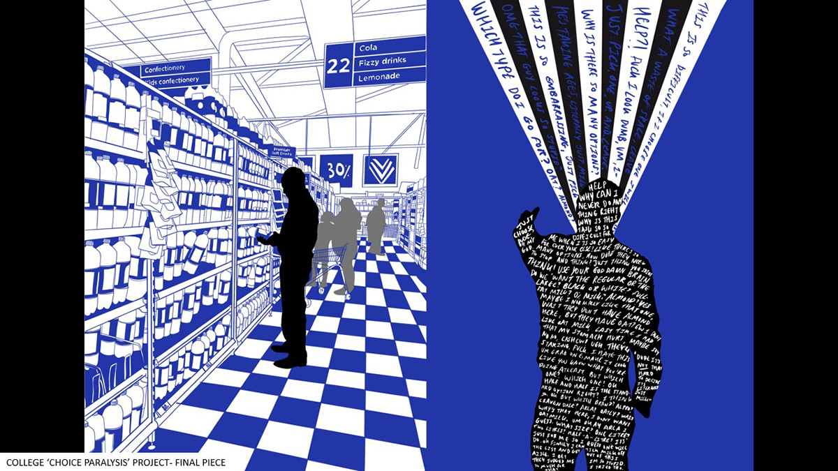
This is the final piece for my 'Choice Paralysis' project. I used a limited colour palette heavily inspired by the work of Kevin Lucbert, though also due to colour theory. Darker shades of blue give off a sterile, sad and isolating ambiance, the perfect anxiety inducing colour palette. I presented this in the style of a double spread magazine article in alignment with the initial project brief. Thus, for my second complementary illustration I used the same colour scheme, with an abundance of capitalised sketched text to portray the constant fast paced stream of incoherent thoughts during an overwhelming event.

A very early mini project series from A-level in response to the characters and storyline from Lewis Carol's 'Alice in Wonderland'. In the illustrative pieces shown above I was experimenting with representing the characters tweedle-dee and tweedle-dum whilst responding to research of the artistic duo 'Gilbert and George'. I used my own photography as model references for the characters I illustrated as well as using a vivid colour palette similar to that of Gilbert and George's works. To help with layout experimentation I used a sketched thumbnail technique. For the larger projected I went in the direction of a different character instead.

As part of a-level coursework I experimented with collage on the app 'Shuffles' in response to Jean-Michel Basquiat. I also responded to his style with some gothic illustrations. I initially looked into Basquiat in relation to the 'Queen of Hearts', a character I would progress to base a bigger project on. I thought they linked well as he is recognised for his iconic crown symbol, as well as his goals to break free from societal expectations. I felt the Queen very much beats to her own drum not unlike Basquiat, though ultimately I went in a different direction.

As part of my a-level coursework I created a unisex clothing brand after initial research into the characters of Lewis Carol's 'Alice in Wonderland'. I took special interest of the 'Queen of Hearts' and her 'deck of cards' soldiers, curious as to how I could explore metaphorically and literally into their themes and colour palettes. Knowing the artist Keith Haring used hearts and 'little men' posing characters within the majority of his works, I took great inspiration from him creating some of my own 'card men' which you can see in my wall mural on the bottom right.
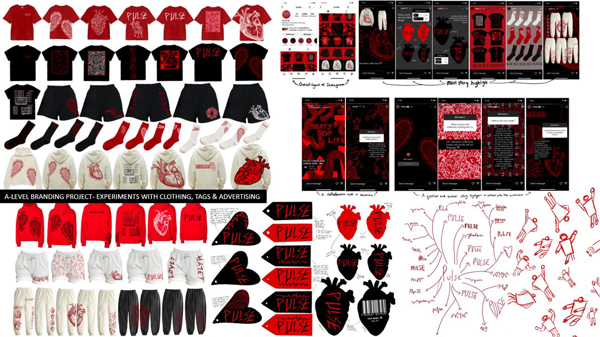
Shown above is the developed clothing brand, I gave the name 'Pulse'. I designed a range of clothing pieces from hoodies to t-shirts using illustrations and text that I designed in response to Keith Haring and the 'Queen of Hearts'. As I was workshopping a brand as a whole I undertook thematic, conceptual and contextual research before experimenting with an online presence, packaging and label designs and murals in consideration of a youthful unisex target audience. Though I primarily used procreate, I did dabble in heat pressing to take one hoodie and sweat-pant set concept into a reality.

As an as initial response to theme of '3' I looked into the artist Ewing Paddock and resultantly ended up trying realism illustration for the first time using my own primary photography as my inspiration. I found this to be a rather time consuming yet enjoyable challenging experience which I plan to experiment with further in future projects. I then played around with the layout in terms of presenting my digital drawings in a more creative way.

Further developing the theme '3' for my a-level exam project I designed a fantasy book trilogy around the song 'Soldier, Poet, King' by The Oh Hellos. I looked into symbology, colour theories and did conceptual research into bookmarks and book cover designs both cloth bound and hardcover sleeves. I did a lot of thematic research into the stereotypical characteristics of the three individuals as I wanted the covers to be as detailed and realistic as real authentic covers for existing books, and so I wrote separate blurbs and quotes for each. Lastly, I designed a map for the trilogy.

Shown above is the experimental stages of my interpretation to the project brief 'Getting Lyrical'. Straight away I knew I wanted to look into the lyrics of Phoebe Bridgers as a lot of her songs give clear visual imagery. I experimented with type and image combinations by hand writing lyrics over top my own primary photography, sticking to a limited colour palette that I felt best represented the dark themes of the lyrics. I also did some type only pieces playing around with the repetition of the lyrics as a diary entry but also in the shape of a brain.

As another interpretation of the brief 'Getting Lyrical' using the lyrics from the song 'Waiting Room' by Phoebe Bridgers I wanted to experiment with illustrating a scene in natural colours vs that of in a previous project I described to be sterile and anxiety inducing, whilst also including the lyrics in a mantra style.

The work shown above is a college project of which we were randomly given a country to research and create a magazine article on of which I was given Mexico. After some general and thematic research I decided to illustrate a piece for a target audience of school kids on the traditional Mexican day of the dead. As I decided on a younger audience I looked into Quentin Blake who specialises in children's book illustrations. I also did secondary and contextual research to ensure I was portraying the religious alter correctly, whilst keeping the digital drawing in the style of Blake.

As part of my fashion rotation week at college I was asked to create patterns in response to emotions, linking in a colour to match. I was then tasked with designing high end fashion using the patterns and colour-ways I had previously created. Extending from this I created an editorial/fashion poster focusing on the gay rights movement from the 1970's. I found this project rather interesting on the research front, however the design aspects where somewhat challenging as I had not experimented with the fashion field much prior to this project.

As part of a college project I researched into the twelve Jungarian archetypes learning the attributes they stereotypically represent before creating a variety of illustrations for each. for each archetype i choose a colour i felt best represented them and experimented with a few 'symbols' in a technique similar to the matrix technique. I then picked one symbol per archetype to best represent them as a uniform set.

Here is a project that I am currently working on after being inspired by the Italian-Sardinian restaurant I work in. Whilst the branding they created for themselves has been successfully bringing in customers for nearly 30 years, I felt I could attempt my own spin on the branding taking into consideration feedback that I have heard from existing customers as well as the location being more attractive for a younger target audience. So far I have changed and experimented with the colour palette, redesigned uniforms, logos and menus and even played around with the concept of brand mascots.

Shown above is a range of photography that I have taken over some years. This is something I enjoy doing but don't do often enough besides taking primary images for art projects. I especially liked experimenting with monochromatic macro photography- some examples of which are shown above that I took of a lettuce sprayed with water.

